Fenris Creations Teases a New HUD Direction for EVE Online
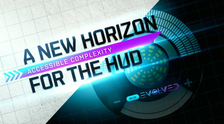
Fenris Creations says it is working on a new HUD direction for EVE Online, aiming to make the interface easier to read and understand without stripping away the depth that defines New Eden. The studio’s goal is to improve how information is communicated to everyone—from brand-new pilots stepping into space for the first time to long-time veterans who already know the current system inside out.
Rather than treating the overhaul as a simplification, the plan focuses on accessibility through clearer presentation. Since the HUD is one of the first interfaces players interact with, Fenris Creations wants the experience to feel more intuitive for beginners while still meeting the expectations of experienced players. In practice, that means making the information flow more legible and more engaging, so the game’s complexity remains intact but becomes easier to grasp.
The HUD rollout will be handled as a progressive, collaborative process inspired by the studio’s Photon UI approach. It will begin with a beta phase in which players can opt in by enabling the new HUD through client settings, test it in normal play, and send feedback. Fenris Creations then plans to iterate—refining the design based on both the responses received from the community and the data gathered during the trial.
Ultimately, the company’s target is to lay groundwork for a modern interface as EVE Online moves into its third decade. Part of that effort is aligning the different existing UI styles, while also preparing the path for future improvements to more complex components—especially challenging systems like the Overview, which plays a central role in how pilots monitor threats, targets, and situational awareness.